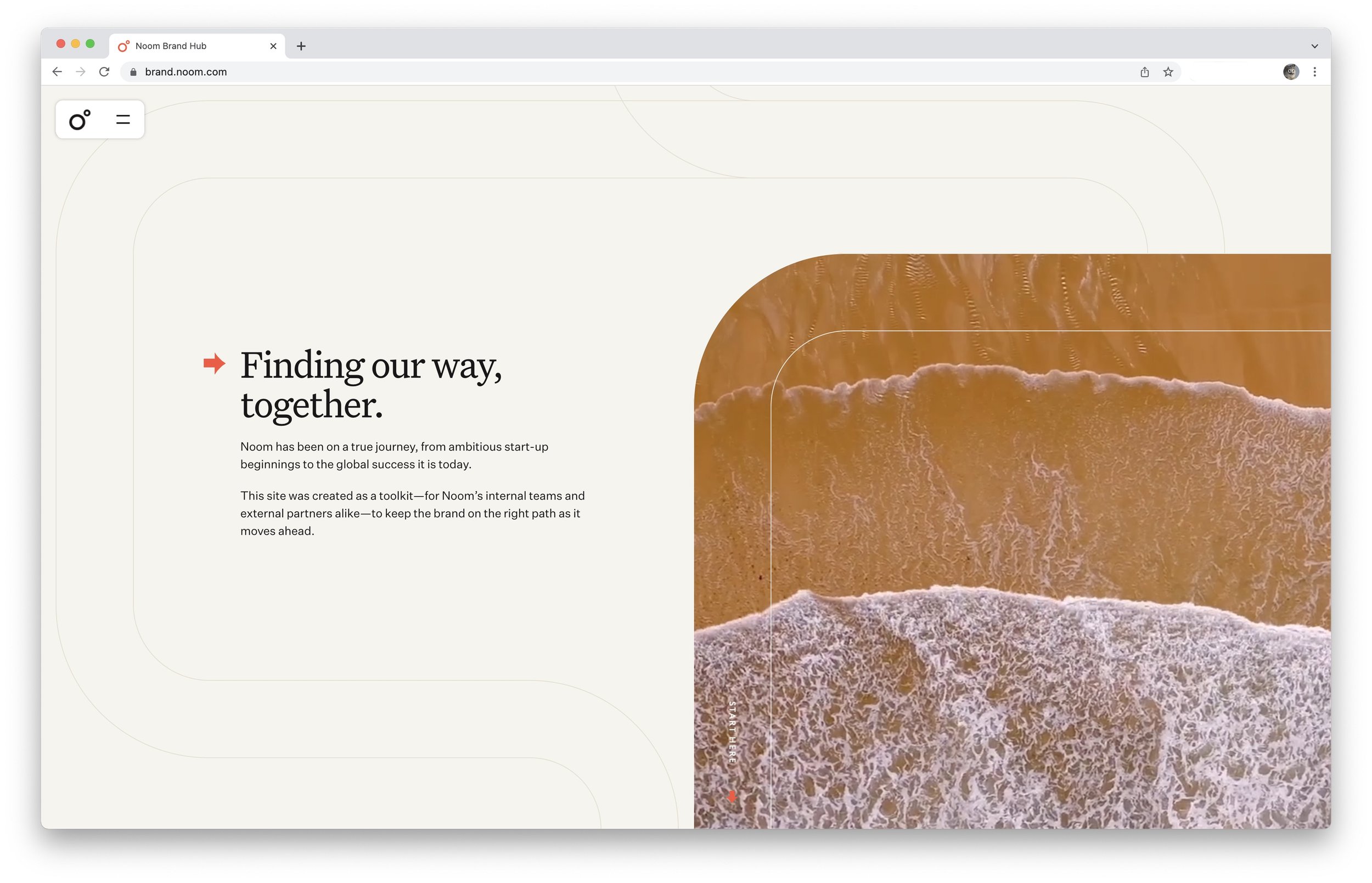
A visual and verbal rebrand for Noom.
Working closely with design studio Gretel, we rebranded Noom—creating an entirely new design system and tone of voice. The system, called “Compass,” is anchored around Noom helping its users navigate healthier choices.
Using Compass, we transformed all brand and growth work, including a 400,000-word curriculum rewrite in the new tone of voice.
Internally, we applied Compass to Noom’s 100,000-square-foot office and everything from deck templates to Zoom backgrounds. I co-led the effort to train 4,000+ Noom employees in the new tone of voice, including the coaching organization.


